Skip to content

Gallery

python examples/gallery.py builds these nineteen figures and audits each one. The script exits non-zero if any figure fails, so they are regression tests with pictures attached rather than decoration.

They exist because demo.py, one panel and three curves, is easy for a gate to pass, and passing an easy case is the wrong thing for a gate to be good at. These are the compositions where a check has somewhere to hide. Writing them found nine defects in the checks themselves, and four in the figures that no check caught. Both kinds are listed at the end of this page.

Every alt text here is the string the figure itself carries, passed to describe(fig, ...) before the audit runs, so the alt-text gate reads it.


Shared scales

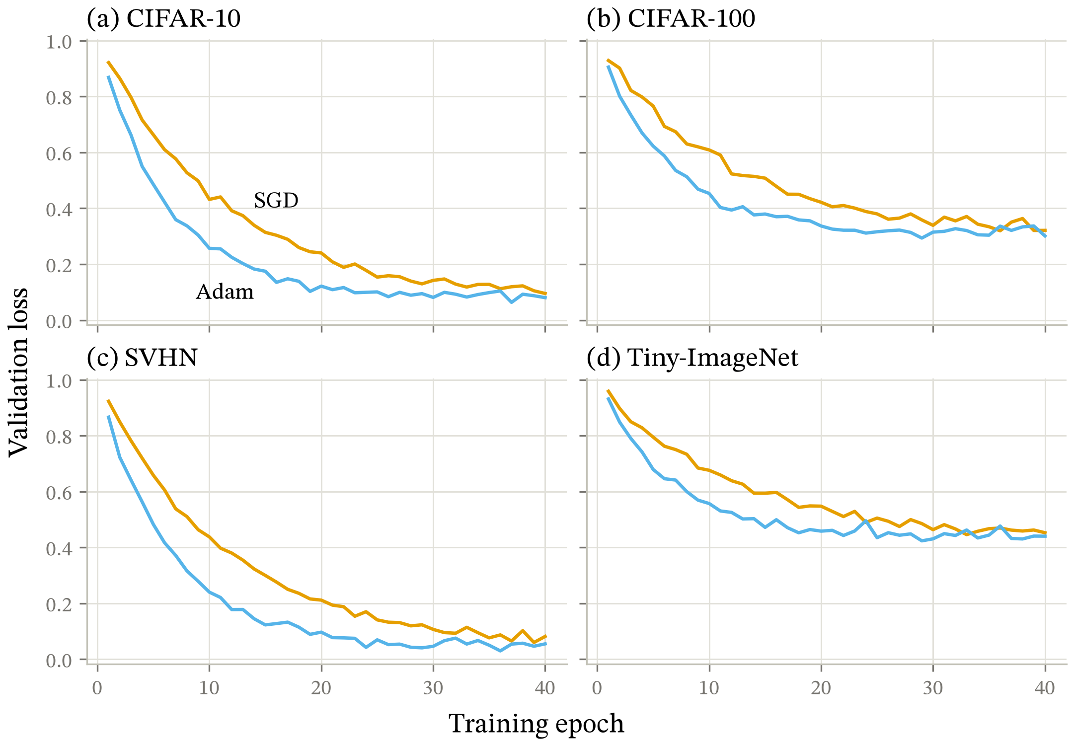
Validation loss against training epoch on four datasets, SGD against Adam. Adam falls faster on all four and reaches a lower floor on CIFAR-10 and SVHN; on CIFAR-100 and Tiny-ImageNet the two converge to the same floor and only the speed differs.
Four panels on one scale, panel letters, per-panel color. The axis-redundancy gate exists for this shape: tick labels and axis titles repeated down a shared column are ink spent saying nothing.

A filled field

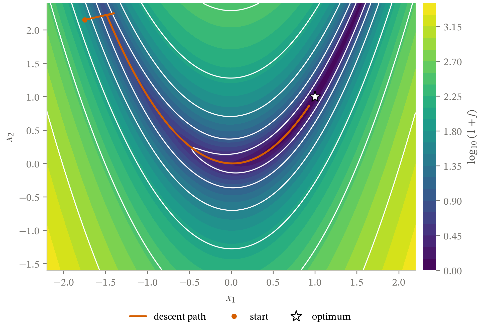
Rosenbrock function on a log scale as a filled viridis field with isolines, and a 6000-step gradient descent path from (-1.75, 2.15). The path drops into the curved valley within two steps and then crawls along it, ending at (0.93, 0.86), still short of the optimum at (1, 1).
A field, isolines, and a colorbar in one panel. This figure broke four checks on its own, more than any other in the set.

No axes at all

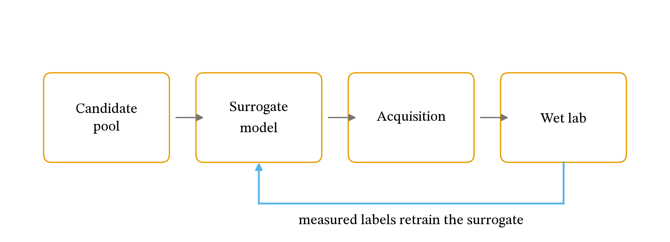
A four-stage active learning loop: a candidate pool feeds a surrogate model, an acquisition function ranks its predictions, and the top candidates go to the wet lab. Measured labels return from the wet lab to retrain the surrogate.
Boxes and arrows with ax.axis("off"). A figure with no data and no visible tick labels is the case most gates were not written against.

Three statistical forms

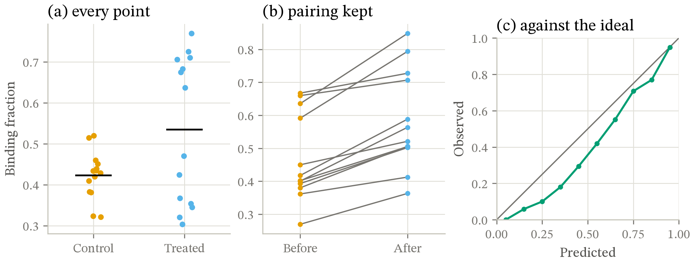
Three panels. (a) Binding fraction for 14 controls and 14 treated samples, every point shown: the treated group is bimodal, which a box plot would hide. (b) Twelve paired before-and-after measurements as a slope graph: all twelve rise. (c) A reliability diagram: observed frequency sits below the diagonal across the whole range, so the model is overconfident.
The three forms choosing a form argues for. Panel (a) is the case no script can decide: a box plot here clears every mechanical gate and still hides both the n of 14 and the bimodality, which are the finding.

Log-log, with a slope triangle

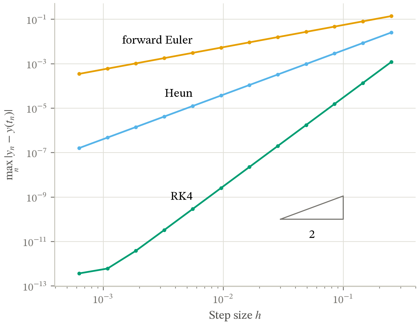
Maximum global error against step size for forward Euler, Heun and RK4 on log-log axes, over step sizes from 1e-3.2 to 1e-0.6. Each method is a straight line of slope 1, 2 and 4 respectively; a slope triangle marks slope 2 for reference. RK4 flattens at the smallest step sizes, where double-precision round-off dominates truncation.
RK4's flat left end is deliberate: a convergence plot that descends forever is a plot of the model, not of the computation. The direct labels sit at the left end, where a log-log fan separates the curves by three decades.

Density as the finding

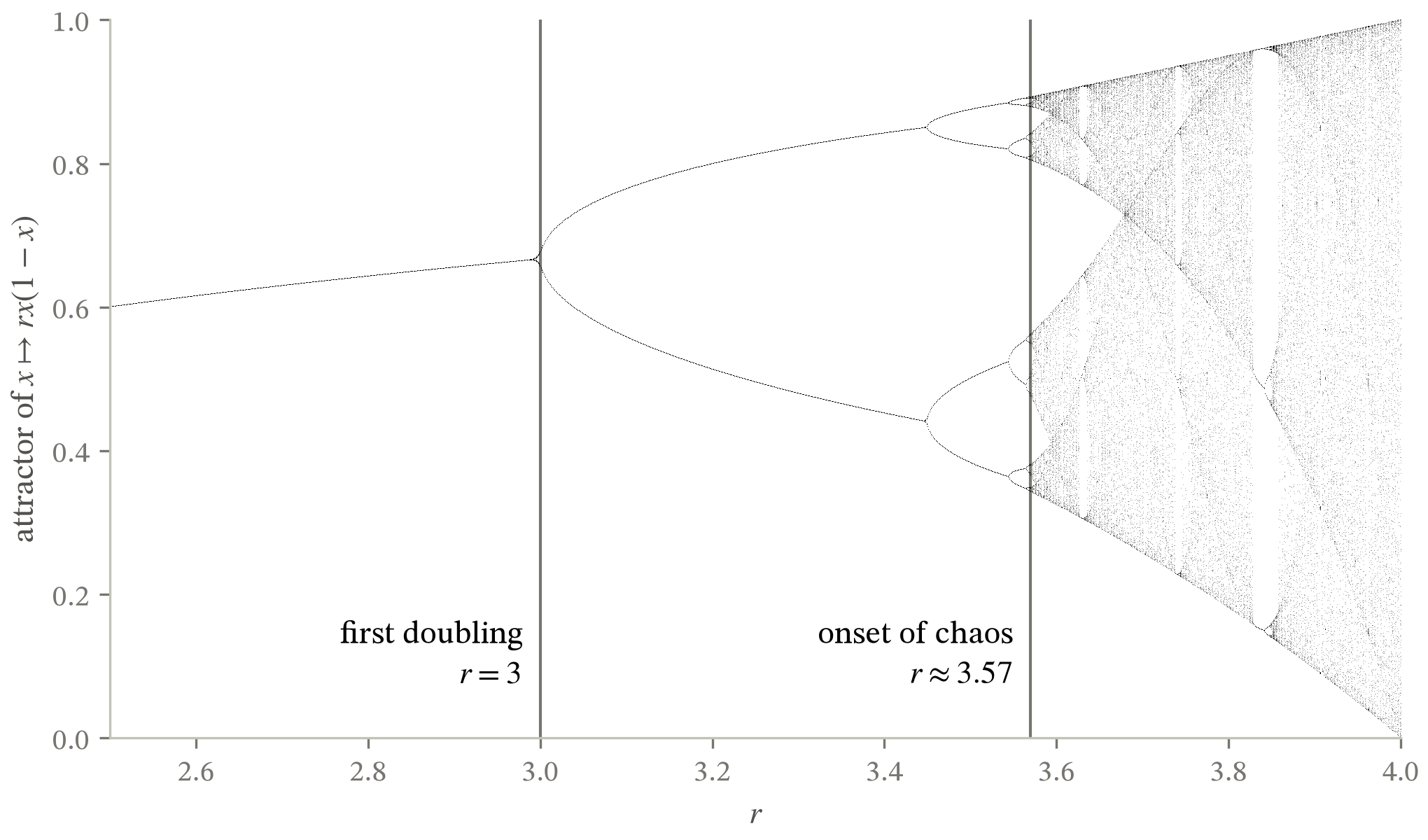
Orbit diagram of the logistic map for r from 2.5 to 4. A single fixed point splits at r = 3, doubles repeatedly at an accelerating rate, and dissolves into a dense chaotic band at r about 3.57, with windows of periodic behaviour inside it; the widest is a period-3 window near r = 3.83.
One mark, one opacity, one hue. 168,000 points that are a single object seen at density, not a series, which is why the ink-coverage row is advisory rather than a failure.

Three encodings

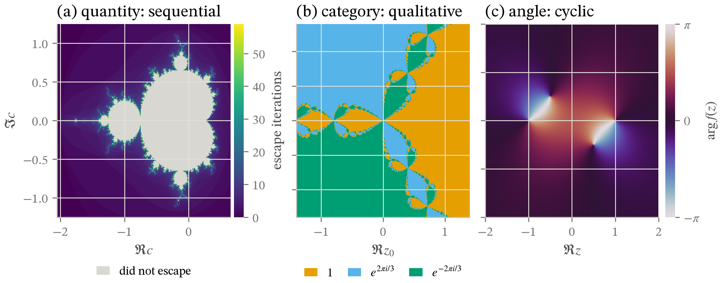
Three complex-plane images, each on a colormap matched to what it encodes, and each with the key that kind of encoding takes. (a) Mandelbrot escape time in viridis, a sequential ramp, read against a colorbar running 0 to 60 iterations; the set's interior is a neutral keyed separately as 'did not escape', because that is a separate class and not a small value. (b) Newton basins for z^3 - 1 in three separated hues with a legend naming the three roots, because a basin is a category, nothing orders them, and a colorbar would be a ruler along nothing. (c) The phase of (z^2 - 1)/(z^2 + i/2) in twilight, a cyclic map, on a colorbar ticked at -pi, 0 and pi whose two ends are the same colour because they are the same angle.
The figure the colormap gate exists for. Escape time is a quantity and takes a sequential ramp; a Newton basin is a category and takes separated hues; a phase is an angle, so its colormap has to close the loop or a false seam appears where it wraps. Each panel takes the key its kind implies: a colorbar is a ruler, so the two continuous panels get one and the categorical panel gets a legend.

A band around each curve

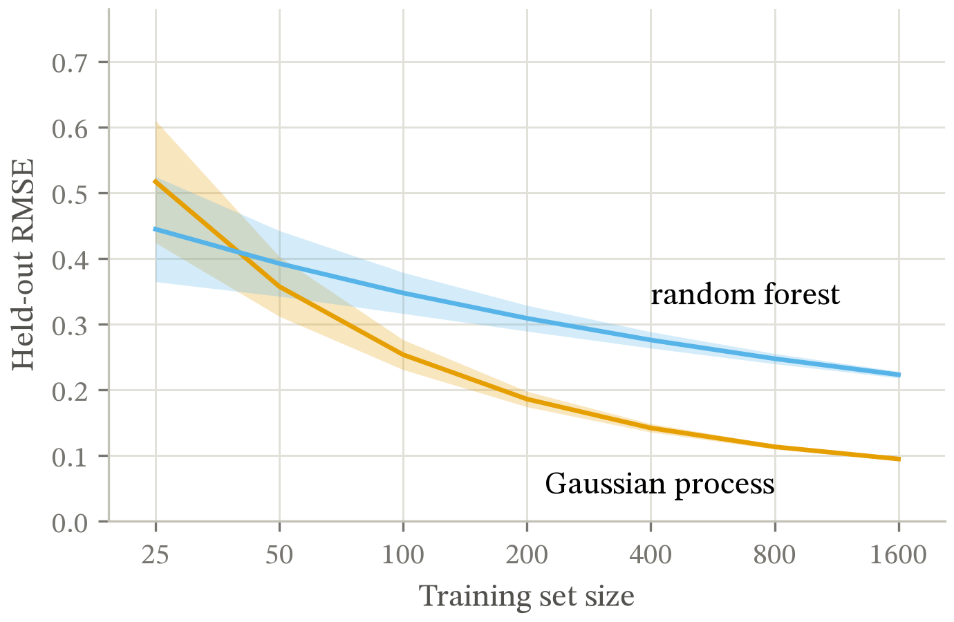
Held-out RMSE against training set size for a Gaussian process and a random forest, each drawn as a line inside its own shaded interval band. The random forest is lower at 25 training points; the curves cross at 40 and the Gaussian process is lower from there on, ending at 0.10 against 0.22 at 1600.
A confidence band lies on top of the curve it belongs to, so the label-attribution gate has to tell a band from a rival series. This is also the one figure here audited for a place rather than for its canvas: venue="neurips", placed_frac=0.75 measures the type and stroke floors at the 0.90x it prints at.

Counts, and a second unit for them

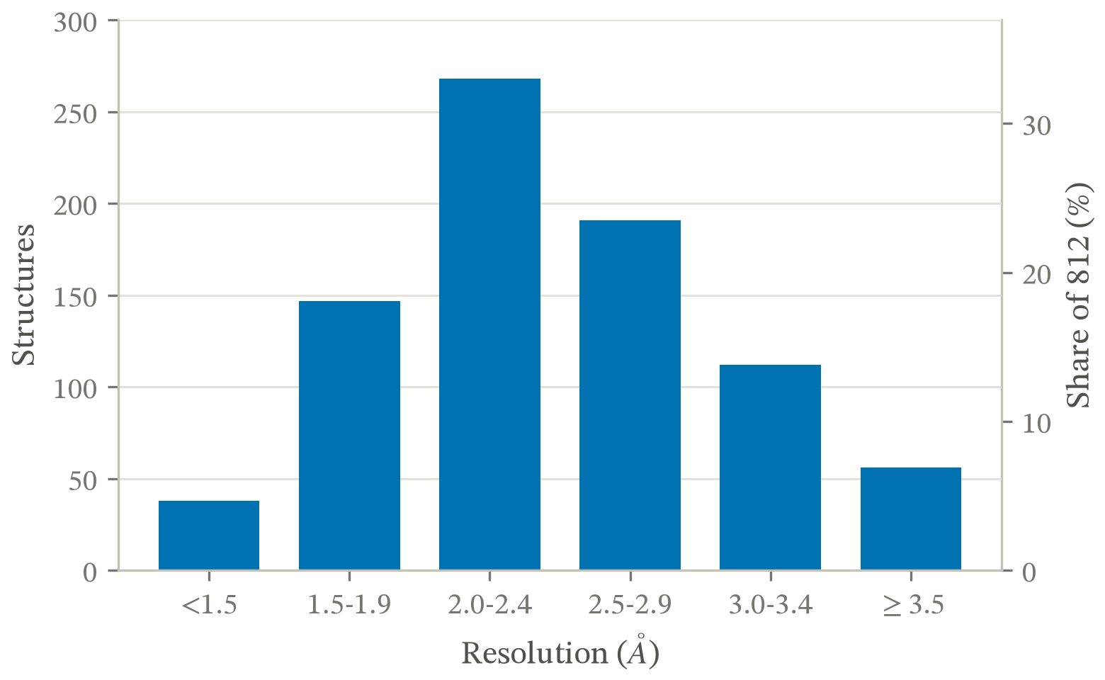
Counts of 812 deposited structures by resolution bin, as bars from a zero baseline. The distribution peaks at 268 structures in the 2.0 to 2.4 angstrom bin and falls away on both sides; the right-hand axis relabels the same bars as a share of the 812.
The only bar chart in the corpus. Counts from zero is the one comparison choosing a form sends to a bar rather than to a dot plot. The right-hand axis is a pure relabel of the same bars, which is the case check_dual_axis exists to permit: secondary_yaxis derives its ticks from the left scale, so the two cannot drift apart the way a twinx with hand-set limits silently can.

A signed field

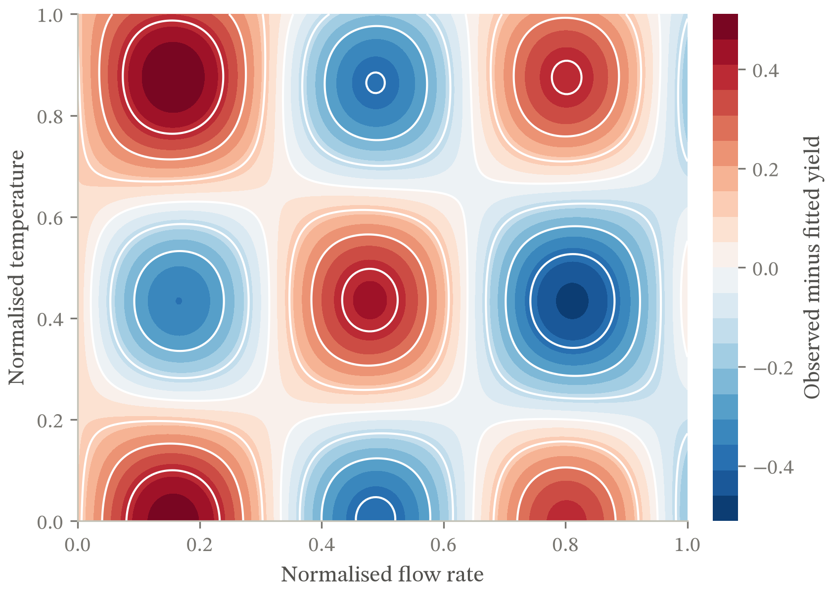
Observed minus fitted yield across a grid of flow rate against temperature, as a diverging red-blue field centred on zero with solid isolines. The residual is not noise: it alternates in a checkerboard of positive and negative cells across both factors, so the fitted model is missing an interaction term.
A residual has a meaningful zero and two directions away from it, which is what a diverging scale is for. The isolines are drawn solid on purpose: contour.negative_linestyle defaults to dashed, so a monochrome contour over signed data ships its negative half dashed with nobody having chosen it, and dashing here means unobserved or projected.

Marks, then bins

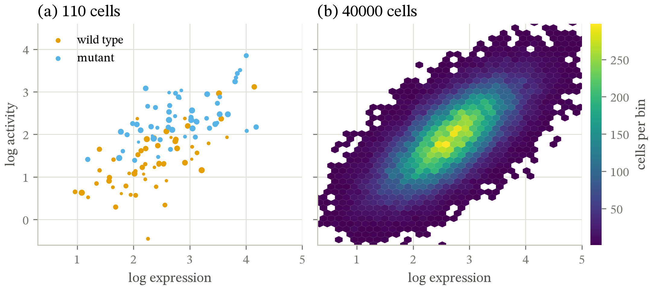
Two panels of log activity against log expression on one pair of scales. (a) 110 cells as a scatter, the two genotypes in two hues, with mark area carrying cell mass. (b) the same measurement on 40000 cells, where the marks would merge, drawn as a hexbin whose color is the count per bin.
Panel (a) varies mark area to carry a third variable. Panel (b) is the answer the overplotting row's own message gives at 40000 points. The shared window is set rather than inherited: limits driven by the large panel's tails squeezed the 110 marks of (a) into a corner until the overplotting row fired at 73%.

A callout that points

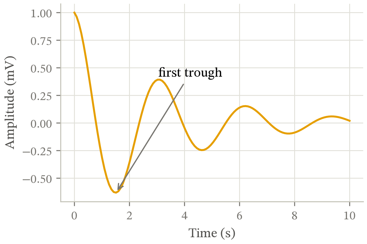
A damped oscillation in millivolts against time in seconds. The amplitude decays from 1.0 at time zero, each swing smaller than the last, and a leader line marks the first trough at about 1.5 seconds, where the signal reaches -0.63.
The leader is the point of the figure. Three rows read one box per string, and on an annotation that box spanned the arrow too, so a one-character callout measured 285 points wide and two labels at opposite corners were reported as overlapping. No corpus figure drew a leader line, which is why three rows could misfire on one for as long as they did.

Two scales for one quantity

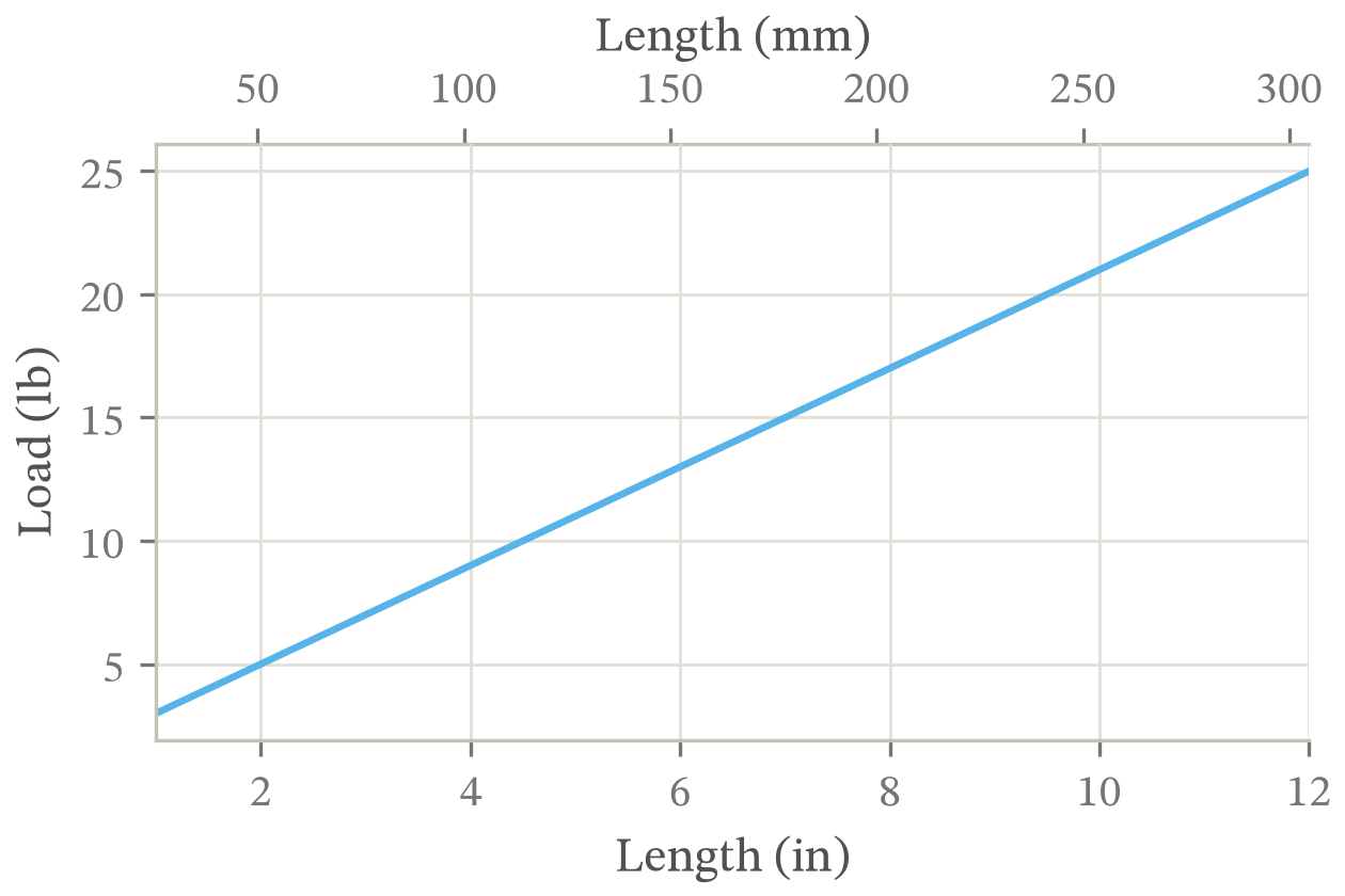
Load in pounds rising linearly with length in inches, from 3 pounds at one inch to 25 pounds at twelve. A second axis across the top carries the same lengths in millimetres, 25 to 305, so the figure can be read in either unit.
A second axis carrying the same quantity in another unit is not a dual axis: there is still one data scale, and the top axis is a unit conversion of the bottom one. A secondary axis is a child axes and never reaches fig.axes, so ticks the locator placed outside its own view were read as clipped text rather than as ghosts.

A survival curve

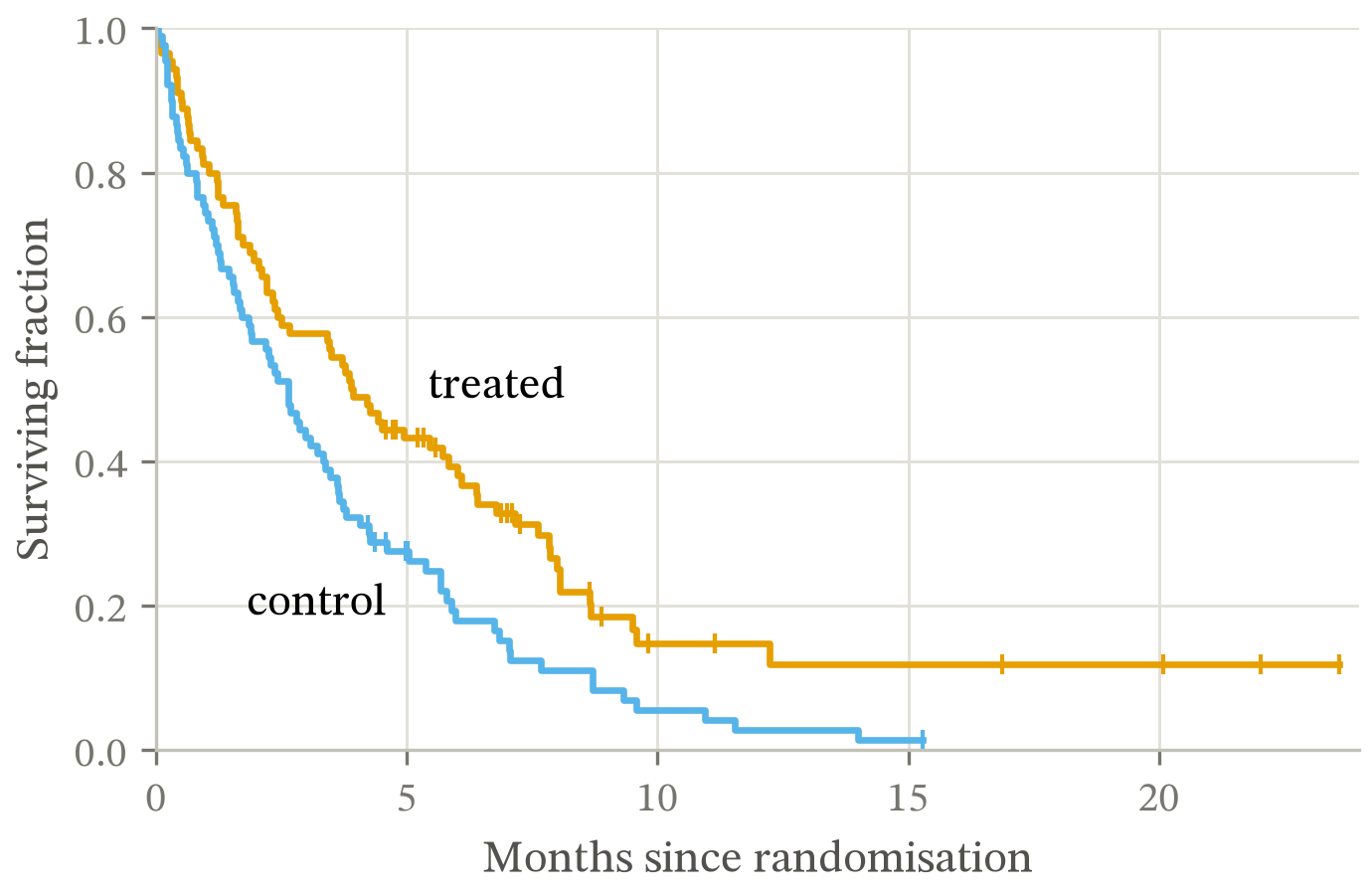
Surviving fraction against months since randomisation, as two Kaplan-Meier staircases over 24 months. Both arms start at 1.0 and step down only at an observed event; the treated arm stays above the control throughout, and short vertical ticks on each curve mark the times where follow-up ended without an event.
The first staircase in the corpus. ax.step keeps the points it was handed and draws risers between them, so the drawstyle has to be expanded before any geometry is harvested; read raw, the label and banking rows measure the diagonal chord of each riser instead of the two segments actually drawn.

A spike raster

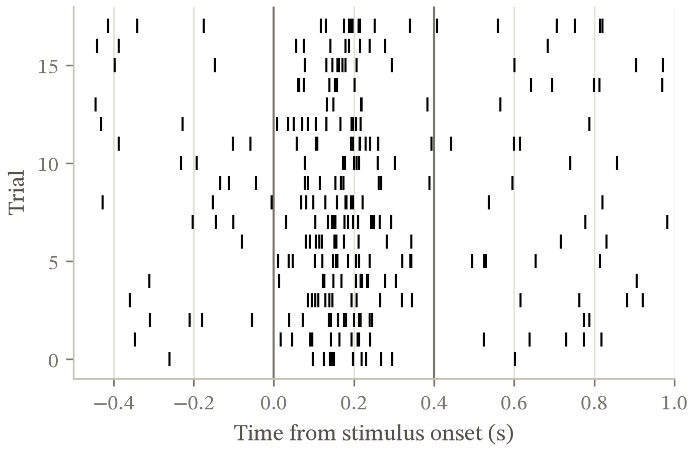
Spike times against trial, one row per trial, over 18 trials from -0.5 to 1.0 seconds around stimulus onset. Two vertical rules mark the stimulus window. Spikes are sparse and evenly spread outside it and pile up inside it, so the response is locked to the stimulus rather than to the trial.
eventplot draws an EventCollection, which reports one linewidth where every other collection reports a sequence. The line-weight gate called list() on it and raised TypeError, which _rows turns into a hard fail: a legal figure failing on a defect in the checker.

A direction, on the projection it belongs on

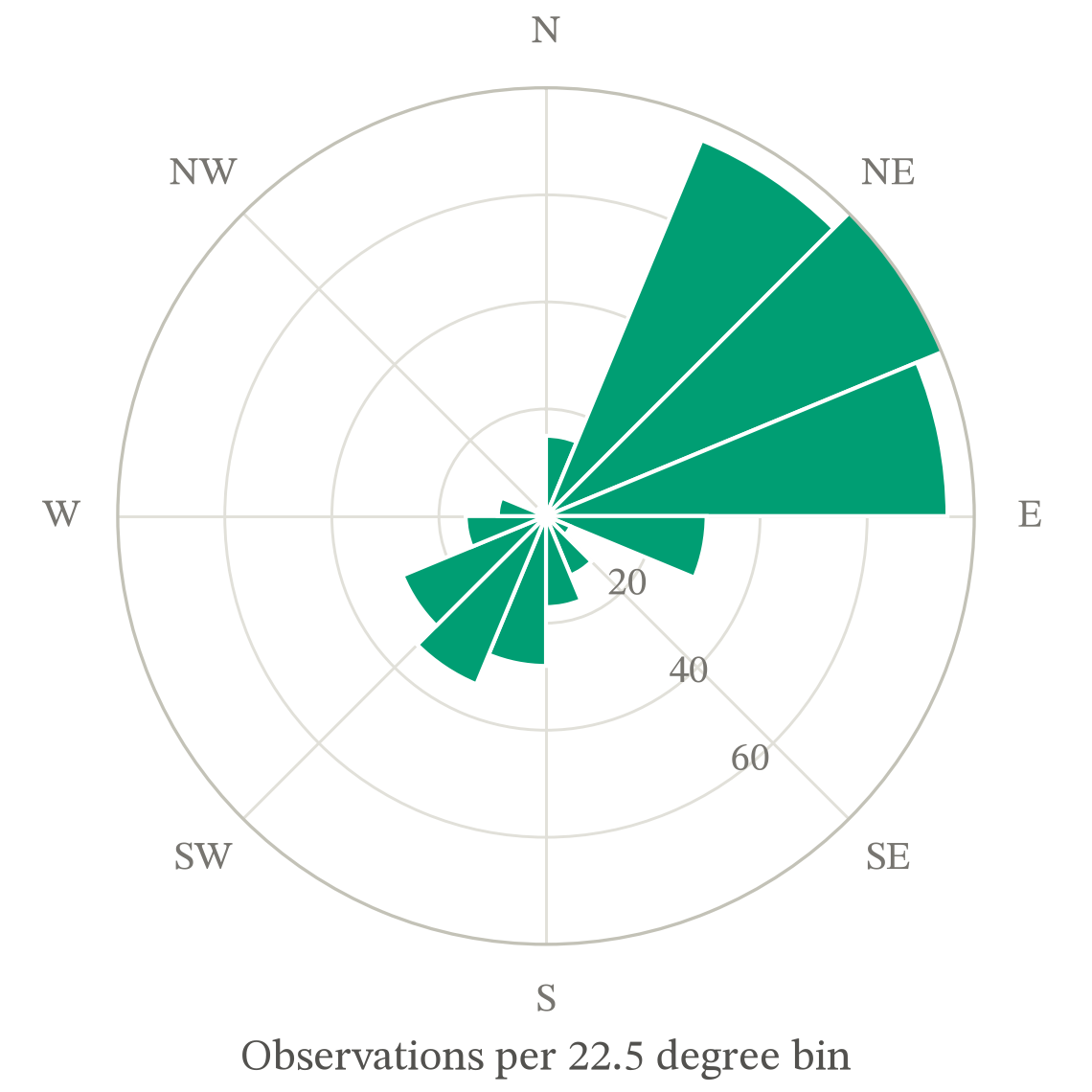
Counts of wind direction in 16 bins of 22.5 degrees, drawn as bars from the centre on a compass rose reading up to 80 per bin. The distribution is bimodal: a dominant lobe covering northeast through east, and a smaller one from the south-southwest, with almost nothing from the north, the northwest or the southeast.
The first polar axes here, and the readability gate carries a clause written for one: a polar radial label sits on the data by construction, so it is set aside rather than reported at 2.0:1. That clause was argued from eight figures, none of which were in this corpus.

Predicted against observed

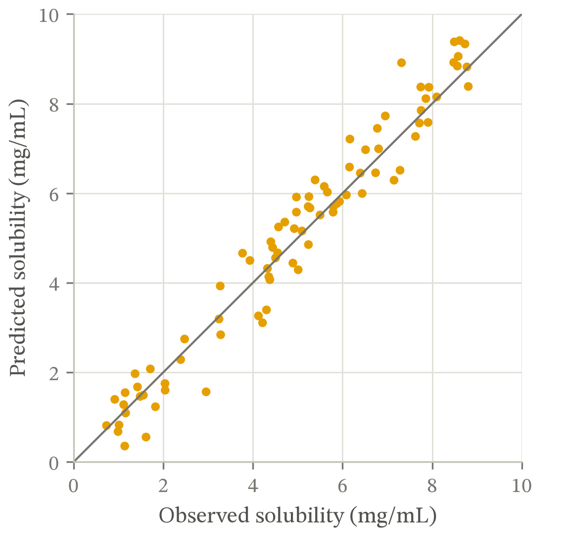
Predicted against observed solubility for 84 compounds, both axes from 0 to 10 milligrams per millilitre, with a 1:1 line. The marks scatter evenly about the line across the whole range rather than fanning out or bending away from it, so the error is roughly constant and the model is not biased at either end.
Every other scatter here varies its mark area, so the overplotting gate had only ever taken the mixed-radius path. Equal marks are the point of a parity plot: each mark is one case and nothing about it is ranked, so varying the area would encode a variable that does not exist.

Boundaries named along themselves

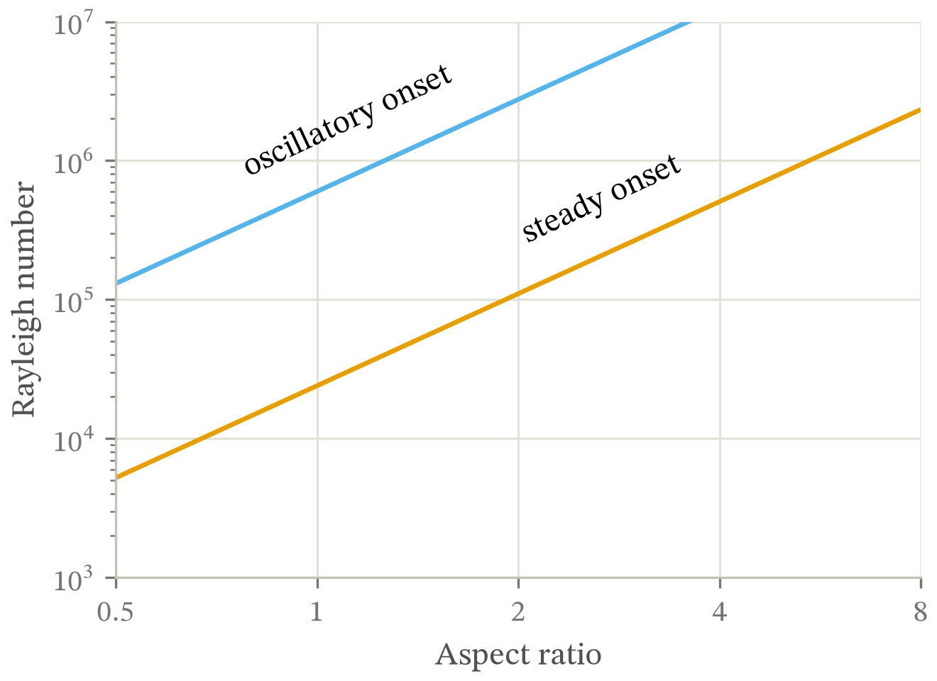
Two onset boundaries on a log-log plane of Rayleigh number from 1000 to 10000000 against aspect ratio from 0.5 to 8. Both are straight on these axes and rise together at the same slope, so they never meet; each is named by a label set along it, steady onset on the lower and oscillatory onset on the upper.
Every string in the first thirteen figures sits at 0 or 90 degrees, so the oriented-box path three gates share had never run. On one 45-degree string, four fifths of the block an axis-aligned box samples belongs to the label only through that box, and strokes 30 pixels from any glyph were reported as ink under it.

A field with its own significance

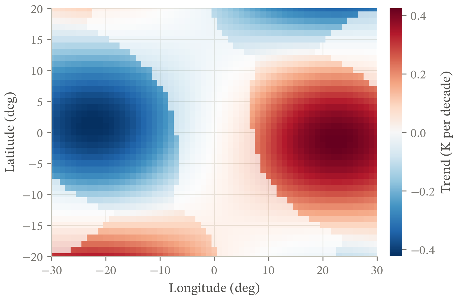
Temperature trend in kelvin per decade across longitude -30 to 30 and latitude -20 to 20, as a diverging red-blue field centred on zero. A cooling lobe fills the western half and a warming lobe of the same size the eastern half, with weaker lobes of the opposite sign at the corners. Cells where the trend is smaller than twice its own noise are drawn faded, so the two strong lobes stand out from a background that is not being claimed.
matplotlib has taken a per-artist alpha array since 3.4, and float() raises on one. The contrast-stack row reads the array rather than the scalar for exactly this figure, counting a ramp across one artist as a single alpha decision; counted per cell it reports sixteen levels of haze and fails a figure that made one choice.

Why figures ten to thirteen exist

The first seven figures were audited against every gate, and the detail strings showed which rows had never measured anything. Five had not. No figure drew a confidence band, a bar, a diverging colormap, a signed contour set, or a scatter, so those rows returned a passing detail seven times over without once running the code that decides.

A row that passes by having seen nothing looks exactly like a row that passed. That is the blind spot how the checkers decide names, and this page had been an example of it.

Why the last six exist

The same question, asked mechanically rather than by eye. Run under coverage, the thirteen figures above never reached a rotated label's oriented box, a LineCollection's widths, a step drawstyle, a polar axes, a per-point alpha array, or the equal-radii path in the overplotting gate: 281 statements of check_figure.py that no figure here could speak for.

Each of the six is a form a reader would recognise before it is a branch, which is the order that matters. A figure drawn to reach a line of code is not evidence about anything. They took the 281 down to 239, and two of them found defects in the checker on the way in. main also audits the sheet's own palette with check_palette, which no figure exercises: that took the second module from 74% to 82% on the same measurement.

The nine defects in the checks

  1. The readability gate reported a schematic's invisible tick labels.
  2. check_ink called every colorbar a saturated panel.
  3. The line-weight gate measured a colorbar's own dividers as hairline strokes.
  4. A path and its start marker in one hue read as a wrapped color cycle.
  5. Testing a label's backdrop against its dominant color failed every annotation ever placed on a heatmap.
  6. check_label_attribution passed labels in the right margin that sat 29px from their own curve and 35px from a neighbour's. A label outside the data is not resolved by proximity to anything.
  7. _encloses tested a band's outline through the affine part of the transform only, so on a log axis a confidence band stopped being its own curve's band and became its rival.
  8. check_line_weight raised TypeError on an EventCollection, which reports one linewidth where every other collection reports a sequence.
  9. check_label_attribution counted a curve's own censoring ticks as a rival series. A companion mark drawn along its curve, in its curve's colour, sits 0px away by construction, so no placement of the label could clear it.

The four defects no check caught

  • The schematic's feedback arrow ran off the bottom of the canvas.
  • The convergence plot's slope triangle sat in the only corner its direct labels could use.
  • The survival curves stopped at the last event, leaving their tail censoring ticks floating with no line beneath them.
  • The regime diagram's boundary labels were rotated by the slope in the data rather than the slope on the page. On log axes those are different numbers, and both strings came out flat beside a rising curve.

All four were obvious in the PNG and invisible to every check. They are why the procedure has a step that says to render the figure and look at it.

The figure the checker is supposed to fail

python skill/scripts/check_figure.py with no arguments builds a deliberately broken figure and audits it, so the self-test proves the gates can fail rather than only that they can pass.
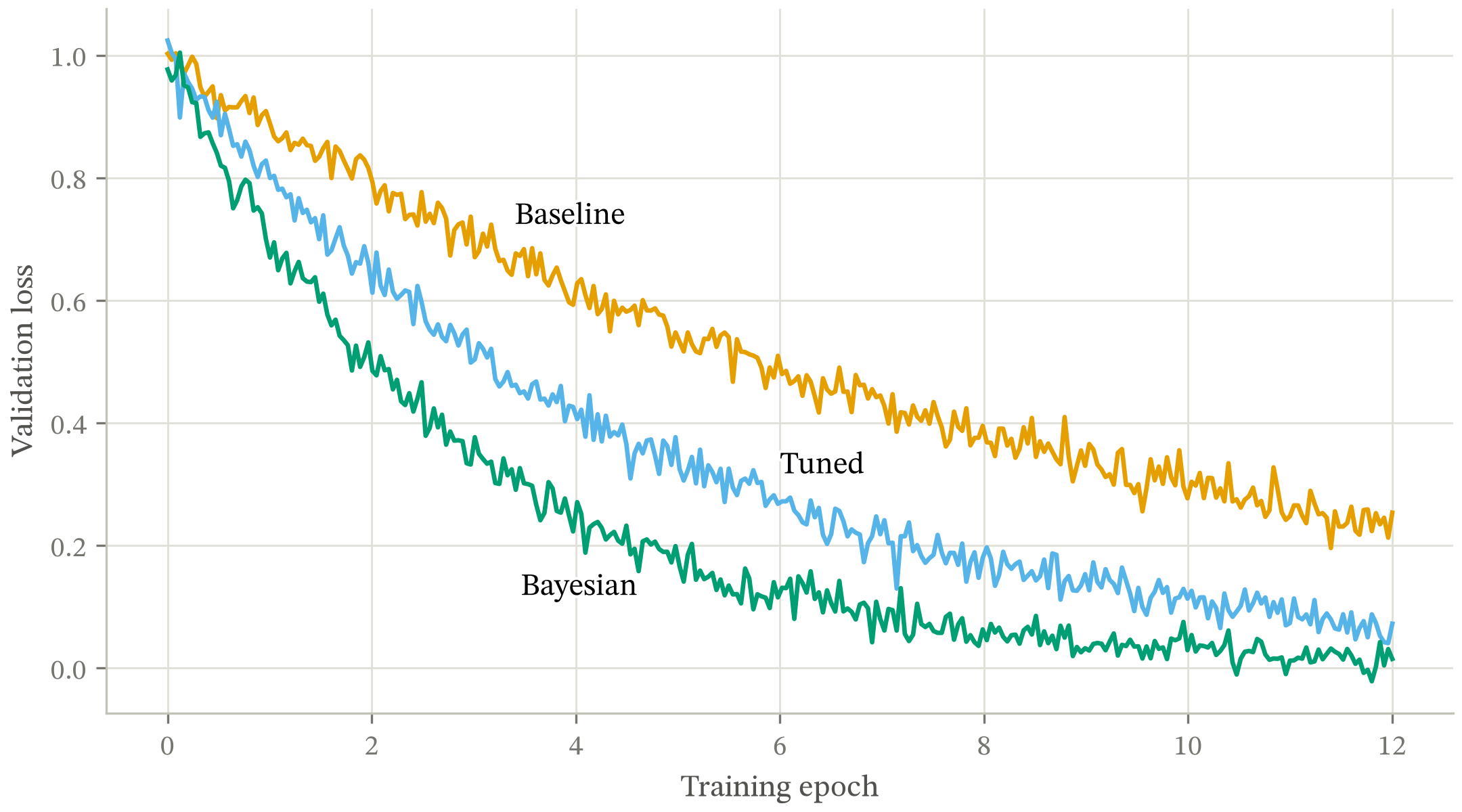
Validation loss against training epoch for three optimisers over 12 epochs. All three fall; the Bayesian run reaches 0.12 by epoch 6 and 0.02 by epoch 12, while the baseline is still at 0.25 at epoch 12.
python examples/demo.py, with every decision commented against the failure it avoids.